Letter Exchange
26 Words exhibition
The 26 Words exhibition is a collaboration between Letter Exchange, the organisation for professionals in the lettering arts, and writers’ group 26. Writers and letterers were paired up at random and allocated a word, again at random, from each letter of the alphabet.
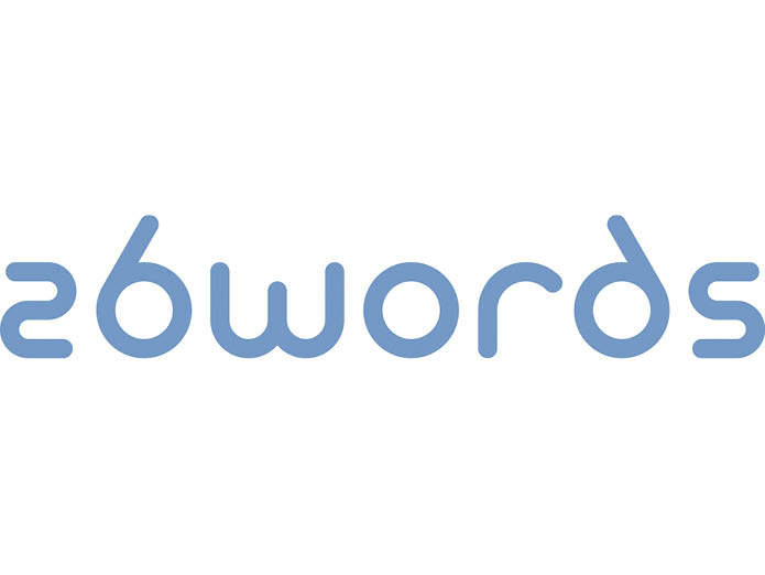
For the exhibition logo, I created a unique set of letters that allowed me to mirror the number 26 to form the ‘ds’ of words. We needed to promote the exhibition before the exhibits were ready so I created a graphic representation of the double helix to pick up on the subtitle ‘exploring the dna of language’. This also allowed me to represent the idea of the two organisations coming together to create something new.
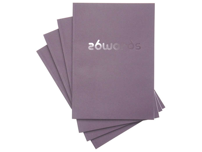
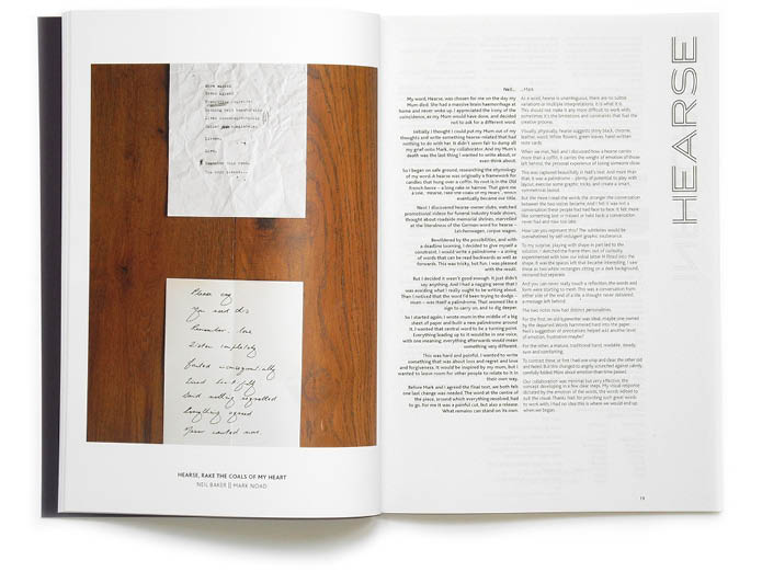
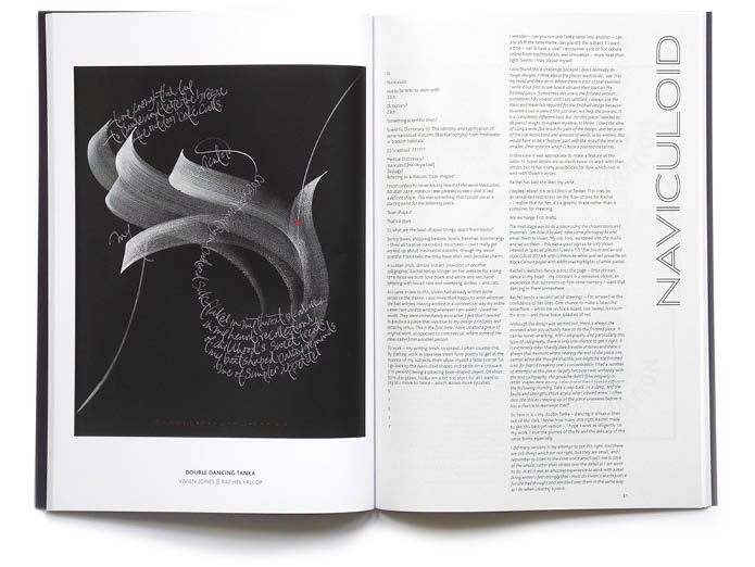
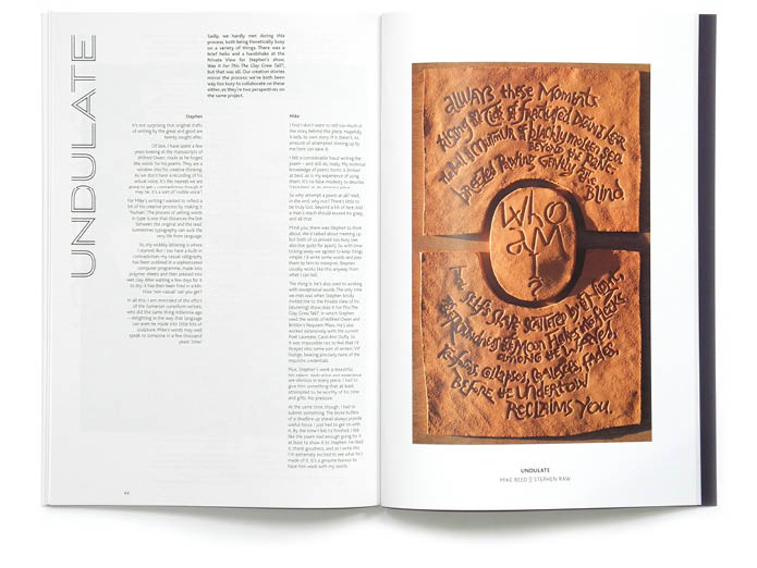
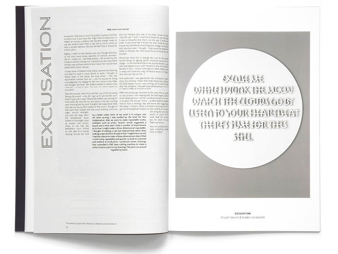
The catalogue contains images of all the works alongside the ‘creation stories’ of each of the pairings. The images needed to be reproduced beautifully which meant they should be printed on good quality, coated stock. However, this meant that the whole thing was going to be too expensive. To save money, I printed the accompanying texts in black only on thin uncoated stock interleaved between the coated pages. This brought it within budget and added interest to the flow of the book.
The layout of the text raised its own problems. Although most of the creation stories were roughly the same length, they were written in such different ways that one layout would not accommodate them all. I opted to keep the typeface the same size throughout but varied each layout in response to the text and the finished artwork. This added interest and variety while still feeling like it was all part of the same book.
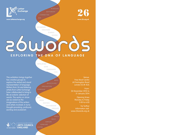
The exhibition poster
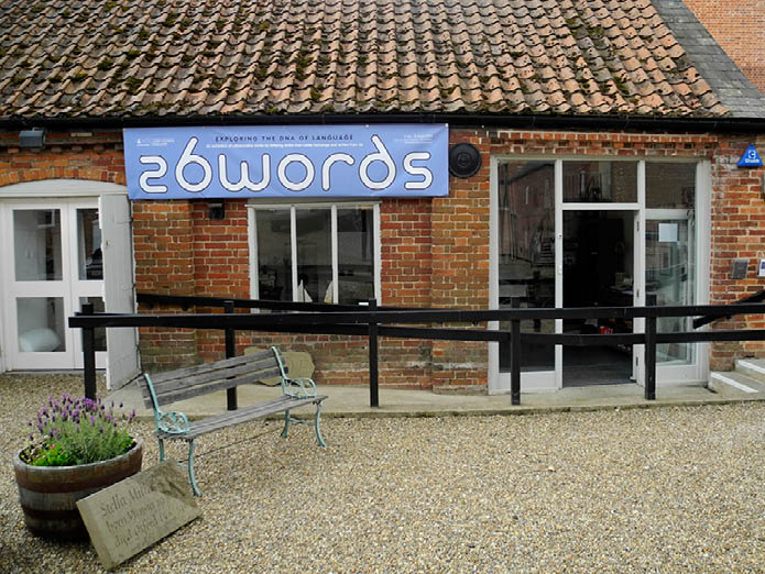
The Lettering Arts Centre, Snape
The catalogue
A spread from the catalogue
A spread from the catalogue
A spread from the catalogue
A spread from the catalogue
8 - 8
<
>