Hearse Rake the Coals of my Heart
26 Words exhibition
This exhibition was a collaboration between Letter Exchange and writers’ group 26. Writers and letterers were paired up at random and allocated a word, again at random, from each letter of the alphabet. My writing partner was Neil Baker our word was Hearse.
For me, this project went in a completely different direction to the one I expected. The power and beauty of Neil’s words, heavily influenced by his mother dying the day the word was chosen, determined the eventual design solution. It’s a great example of how well the design process works if you keep an open mind and avoid preconceptions.
Following is my ‘creation story’ about the project that appeared in the catalogue:
As a word, hearse is unambiguous, there are no subtle variations or multiple interpretations, it is what it is. This should not make it any more difficult to work with, sometimes it’s the limitations and constraints that fuel the creative process.
Visually, physically, hearse suggests shiny black, chrome, leather, wood. White flowers, green leaves, hand-written note cards.
When we met, Neil and I discussed how a hearse carries more than a coffin, it carries the weight of emotion of those left behind, the personal experience of losing someone close.
This was captured beautifully in Neil’s text. And more than that, it was a palindrome – plenty of potential to play with layout, exercise some graphic tricks, and create a smart, symmetrical layout.
But the more I read the words the stronger the conversation between the two voices became. And I felt it was not a conversation these people had had face to face. It felt more like something lost or missed or held back; a conversation never had and now too late.
How can you represent this? The subtleties would be overwhelmed by self-indulgent graphic exuberance.
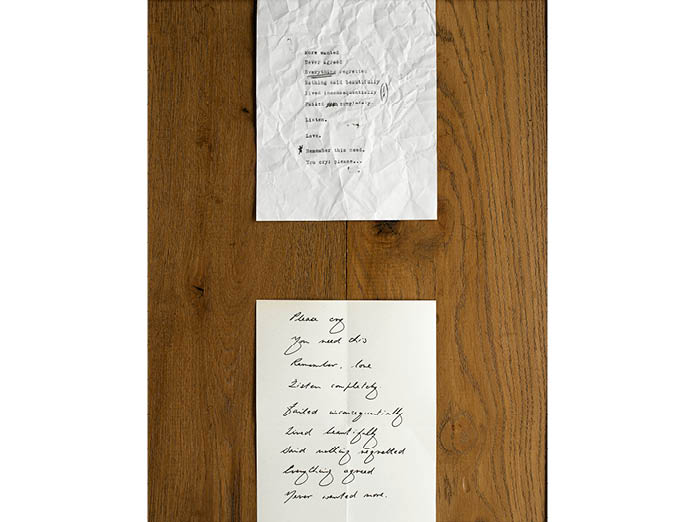
To my surprise, playing with shape in part led to the solution. I sketched the frame then, out of curiosity, experimented with how our initial letter H fitted into the shape. It was the spaces left that became interesting. I saw these as two white rectangles sitting on a dark background, mirrored but separate.
And you can never really touch a reflection, the words and form were starting to mesh. This was a conversation from either side of the end of a life, a thought never delivered, a message left behind.
The two notes now had distinct personalities.
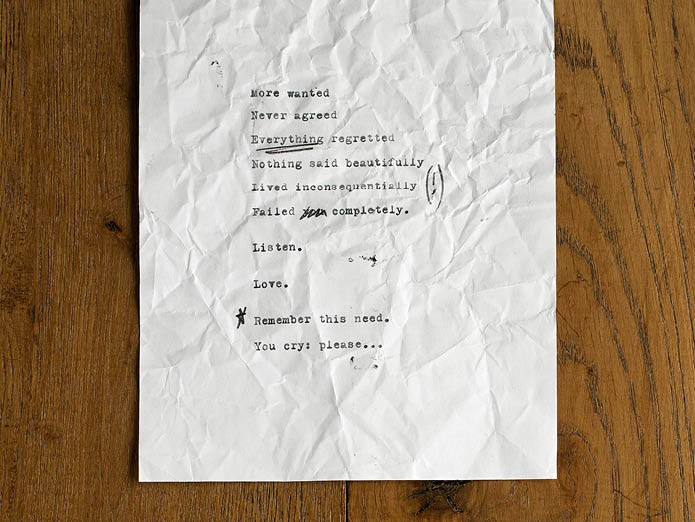
For the first, an old typewriter was ideal, maybe one owned by the departed. Words hammered hard into the paper. Neil’s suggestion of annotations helped add another level of emotion, frustration maybe?
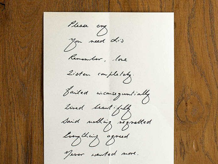
For the other, a mature, traditional hand, readable, steady, sure and comforting.
To contrast these, at first I had one crisp and clear, the other old and faded. But this changed to angrily scrunched against calmly, carefully folded. More about emotion than time passed.
Our collaboration was minimal but very effective, the concept developing in a few clear steps. My visual response dictated by the emotion of the words, the words edited to suit the visual. Thanks Neil for providing such great words to work with, I had no idea this is where we would end up when we began.
Always have an open mind, let the answer find you.
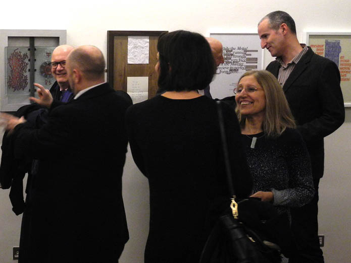
The opening night at the Free Word Centre in London
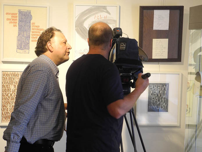
Being filmed for Belgian television in Bruges Library
1 - 5
<
>
Buy the limited edition artwork