Tom Eckersley: Master of the Poster
London College of Communication
11 - 29 January 2014
This review first appeared in Forum issue 27
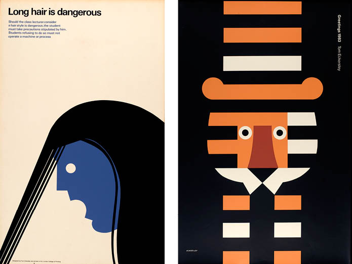
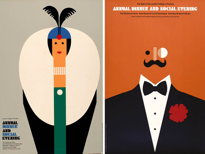
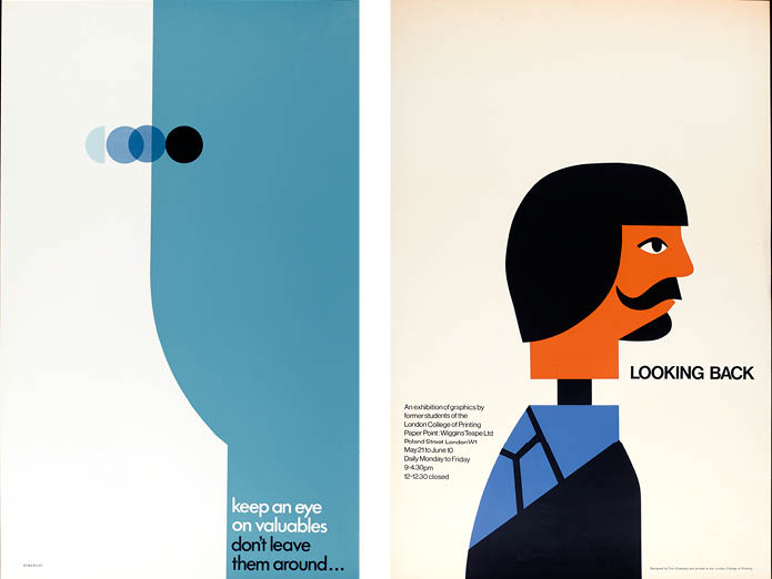
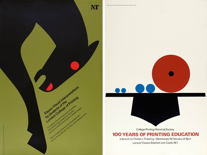
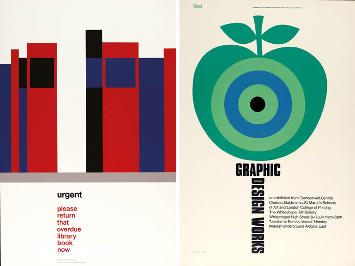
To mark the centenary of Tom Eckersley’s birth, the London College of Communication put on an exhibition of his work featuring 40 posters selected from the University of the Arts London’s Eckersley archive. The show is not only a visual feast but also a reminder of Eckersley’s importance in the development of British graphic design, he set up the UK’s first undergraduate graphic design course at the college in 1954.
I was introduced to Eckersley while at college when he came to give a talk about his work. In the years since, I’ve seen his posters reproduced in books and magazines when searching for inspiration and have admired their simple sophistication. But until this exhibition, I don’t think I’d seen the originals. And that makes a difference.
Eckersley posters were informed by his understanding of their wider context, how they were to be reproduced, their relationship to the viewer, and the strengths (and weaknesses) of the printing process. These elements become apparent when standing in front of the originals. The scale of each and the intensity and subtlety of the colours are things that cannot be adequately conveyed through reproduction. As I wandered around, I found myself at different distances from the exhibits, moving in and out subconsciously to the range they were designed to be viewed from, maybe in a busy corridor or across a station platform.
I was struck by his use of type, functional or playful in turns depending on the subject, never dominating (actually surprisingly small in most cases) but always vital to the balance of the poster. The image grabs your attention then the type provides the detail in a seamless delivery of the message. Eckersley really was a master of the poster, a designer who understood his medium and was in full command of it.
On the way home from the show I looked more closely at the posters I passed, in particular ones produced for London Underground carrying a similar ‘public service’ message to most of Eckersley’s. To a certain extent, these still follow a similar style: the images tend to be simple; there are some good visual puns; and they use bold blocks of colour. But they don’t have the same impact, they don’t grab your attention or convey their message as effectively.
I’ve been trying to work out why that is and it will take more than this review to explain. But, in short, Eckersley’s posters are bolder but more subtle, the images are more abstracted and yet clearer, the text quieter but still memorable, his colours are just as vibrant yet more sophisticated.
One clue as to why this may be is on most of the posters in the exhibition – his signature. These are the product of a focussed creative mind, someone who has the respect and trust of their client and knows how to create something that will stand out. That vision and understanding of purpose gave Eckersley the confidence to put his name to his work and the support of those commissioning him to allow him to do so.
1 - 5
<
>